Before diving into the Animated Navigation code, it’s essential to understand the three core components used to build any website:
- HTML (Hypertext Markup Language) provides the structure.
- CSS (Cascading Style Sheets) handles the presentation and design.
- JavaScript adds functionality and interactivity.
Contents
Let’s break down the HTML structure used in the given code.
<!DOCTYPE html>
<html lang="en">
<head>
<meta charset="UTF-8" />
<meta name="viewport" content="width=device-width, initial-scale=1.0" />
<link rel="stylesheet" href="style.css" />
<title>Animated Navigation</title>
</head>
<body>
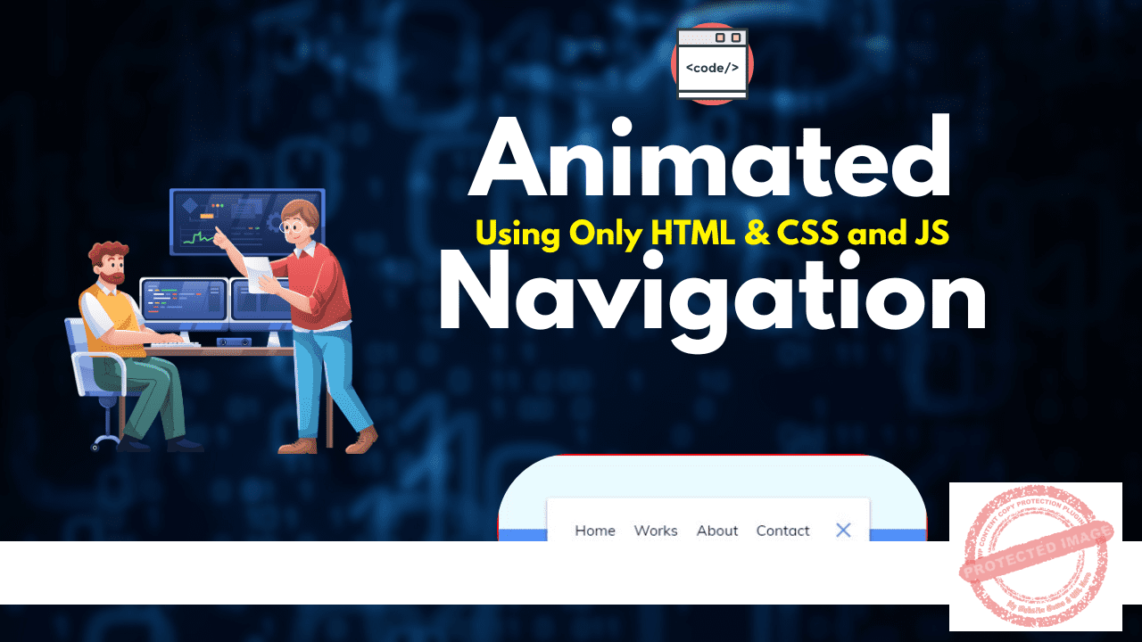
<nav class="active" id="nav">
<ul>
<li><a href="#">Home</a></li>
<li><a href="#">Works</a></li>
<li><a href="#">About</a></li>
<li><a href="#">Contact</a></li>
</ul>
<button class="icon" id="toggle">
<div class="line line1"></div>
<div class="line line2"></div>
</button>
</nav>
<script src="script.js"></script>
</body>
</html>
- The
<meta charset="UTF-8">tag defines the character set of the page, ensuring it supports most languages. - The
<meta name="viewport" content="width=device-width, initial-scale=1.0">tag makes the page responsive, which is crucial for mobile devices. - The
<link rel="stylesheet" href="style.css">links an external CSS file for styling. - The
<nav>tag contains the navigation bar with links in an unordered list (<ul>) and a toggle button (<button>) to control visibility. - The
<script src="script.js">tag links to the external JavaScript file that handles interaction.
Here’s the CSS code used for styling and animation.
@import url('https://fonts.googleapis.com/css?family=Muli&display=swap');

* {
  box-sizing: border-box;
}

body {
  background-color: #eafbff;
  background-image: linear-gradient(to bottom, #eafbff 0%, #eafbff 50%, #5290f9 50%, #5290f9 100%);
  font-family: 'Muli', sans-serif;
  display: flex;
  align-items: center;
  justify-content: center;
  height: 100vh;
  margin: 0;
}
- Box Model: The
box-sizing: border-box;rule ensures that padding and borders are included in an element’s total width and height, which helps with layout consistency. - Flexbox: The
display: flex;along withalign-itemsandjustify-contentcenters the content horizontally and vertically.
nav {
  background-color: #fff;
  padding: 20px;
  width: 80px;
  display: flex;
  align-items: center;
  justify-content: center;
  border-radius: 3px;
  box-shadow: 0 2px 5px rgba(0, 0, 0, 0.3);
  transition: width 0.6s linear;
  overflow-x: hidden;
}
- The
navelement has a background color, shadow, and padding to style it, while thetransitionproperty ensures smooth animations when the width changes.
cssCopy codenav.active {
  width: 350px;
}

nav ul {
  display: flex;
  list-style-type: none;
  padding: 0;
  margin: 0;
  width: 0;
  transition: width 0.6s linear;
}
- The
.activeclass expands the navigation when the user clicks the toggle button. It also applies a rotation animation to the list items (<li>elements) when they appear.
cssCopy code.icon {
  background-color: #fff;
  border: 0;
  cursor: pointer;
  height: 30px;
  width: 30px;
}

.icon .line {
  background-color: #5290f9;
  height: 2px;
  width: 20px;
  position: absolute;
  top: 10px;
  left: 5px;
  transition: transform 0.6s linear;
}
- The
iconrepresents a button with two lines (like a hamburger menu). When clicked, it triggers an animation that rotates these lines.
Here’s the JavaScript code that adds interactivity to the navigation bar.
javascriptCopy codeconst toggle = document.getElementById("toggle");
const nav = document.getElementById("nav");

toggle.addEventListener("click", () => nav.classList.toggle("active"));
- DOM Selection: The
getElementById()function selects the toggle button and the navigation. - Event Listener: The
addEventListener("click", ...)sets up an event listener that waits for a click on the button. - Class Toggling: When the button is clicked, the
classList.toggle("active")method either adds or removes the “active” class from the<nav>element, causing it to expand or collapse.
By combining these three technologies (HTML for structure, CSS for styling, and JavaScript for functionality), you create an interactive and animated navigation bar.
Important Links
| Other Post | Click Here |
| Join Facebook Group | Click Here |
| Join Telegram Channel | Click Here |
| Web Stories | Click Here |


